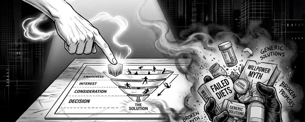
If you're still sending cold traffic straight to a product page, you're burning cash. The most sophisticated DTC brands have figured out that the highest converting path isn't a direct pitch — it's a quiz funnel.
An ecommerce quiz does the heavy lifting that a standard landing page can't. It validates the problem, disqualifies previous solutions, and introduces a new mechanism, all while making the customer feel like they are co-creating their own personalized solution.
We broke down the 5 DTC quiz funnels we're currently obsessed with — every one of them is dissected step-by-step inside our Funnel Teardowns library — and exactly what you can steal from each one.
Try a live quiz funnel demo here.
1. Liven: The 42-Step Psychometric Funnel (4M+ Visits/Month)
Liven is the OG of the app-style onboarding funnel, and they've weaponized that exact playbook to sell a mental wellness subscription. Their funnel is a masterclass in psychological progression — and at 42 steps with 26 questions, it's the longest one we've ever broken down.
The Flow: Native Facebook ad → Gender selector landing → 26-question psychometric assessment → Triple authority stack → Scratch-to-reveal discount → Subscription pricing
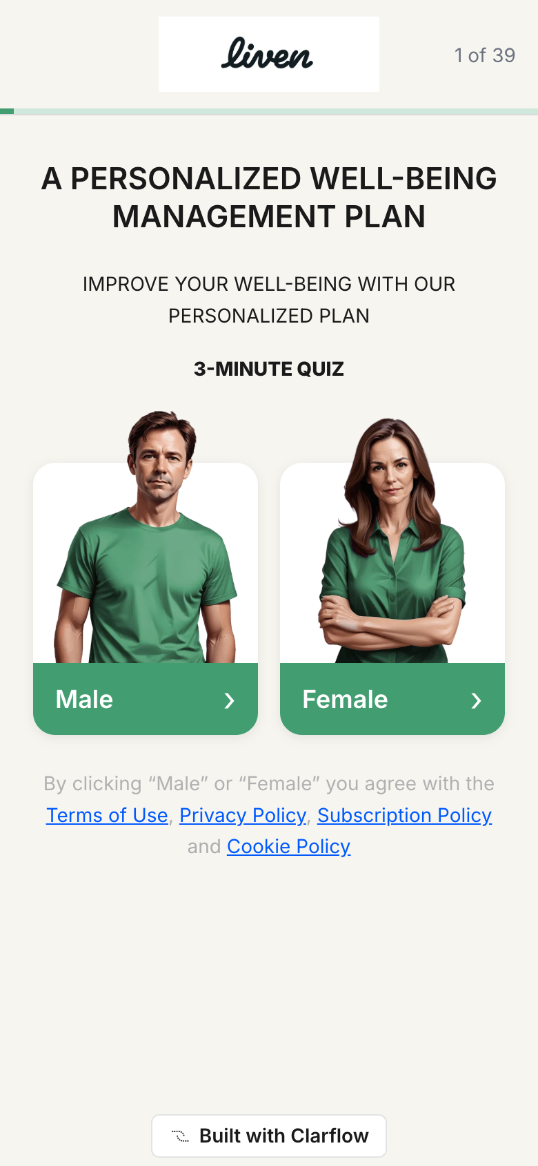
What makes this ecommerce quiz funnel so effective is the 5-stage psychological arc. Users uncover emotional patterns and wellness needs before they ever see a product. The quiz is the conversion mechanism. The product is just what comes after.
Stage 1 — The Self-Label Trap (Q1–Q6). It starts with zero-friction questions — gender, age, energy levels. By question 6, you're admitting you have a problem. You didn't answer a quiz; you told yourself you have a problem. The commitment chain has started.
Stage 2 — The Likert Barrage (Q7–Q15). A series of agree/disagree statements like "I often feel overwhelmed by the amount of tasks I have to do" and "I often struggle to pursue my ambitions due to fear of messing up." The only honest answer is "Strongly Agree." Every "Strongly Agree" equals deeper investment.
Stage 3 — The Cost Expansion (Q16–Q22). Multi-select checklists about life stressors, sleep issues, habits to quit. Pain in your head is ignorable; pain spread across your sleep, relationships, and mornings is not.
Stage 4 — The Authority Crescendo. Three back-to-back interstitials drop trust signals like a freight train: Harvard/Oxford/Cambridge logos, then a licensed mental health counselor with a CBT triangle diagram, then "Join over 2,500,000 people" on a world map. Academic, professional, and social authority — every objection nuked in sequence.
Stage 5 — The Pseudo-Diagnosis. The results page looks clinical: a "HIGH" negative-effects gauge in red, four metrics like "Main difficulty: Overthinking" and "Trigger: Personal reason." It's not a quiz result; it's a diagnosis. Then a scratch card reveals your 50% off — gamified price anchoring that triggers the same dopamine hit as a lottery win.
What to steal: Use Likert agree-scale statements to force self-diagnosis. Don't ask questions — make statements they have to confirm. By the time they see the product, they've already convinced themselves they need it. And add a scratch-to-reveal discount somewhere between the diagnosis and the price — users who physically uncover a deal feel more compelled to use it than those who are just shown a banner.
2. Hike Footwear: The Confession-Then-Reframe (4M+ Visits/Month)
Selling shoes to people who can't walk is a completely different game than selling to fitness bros. Hike Footwear targets adults 40+ with foot, knee, and back pain — and their 12-step quiz is a confession booth disguised as a foot health assessment.
The Flow: Interrupt-based Facebook ad → "No email, no obligations" landing → 7 emotional questions → Mid-quiz belief shift → 1,243-person comfort projection → 50% off offer

See the full Hike Footwear teardown →
This audience is problem-aware. They know their feet hurt. They just don't know their "comfortable" shoes are the cause. The quiz forces a confession from question one: "What's holding you back from enjoying life to the fullest?" The next question doubles down: "How is foot discomfort affecting your daily life?" with options like limiting my independence and affecting my relationships.
By the time the quiz mentions footwear, you've already articulated that your foot pain is destroying your relationships and stealing your independence. You're not shopping for shoes anymore — you're seeking a solution to a life problem.
Then the highest-leverage screen in the entire funnel drops:
"Most 'Comfortable' Shoes Are Weakening Your Feet."
Over 80% of adults over 40 experience foot issues caused by overly cushioned or stiff shoes. Your feet are designed to move — not be restricted.
Before this screen: "I have bad feet." After this screen: "I have weakened feet because of bad shoes." That single reframe makes the product the only logical answer.
The kicker is the results page. Instead of generic testimonials, Hike says: "We've evaluated your answers and prepared a summary from 1,243 people similar to your profile." Then it shows a line chart of 89% comfort improvement over 30 days. Peer-validated, not celebrity-endorsed.
What to steal: The confession-then-reframe sequence. Ask what they've tried, let them admit failure, then hit them with the mechanism reframe. It's competitive destruction without naming a single competitor — the reader makes the connection themselves, which is cleaner and more persuasive than any comparison chart you'll ever build. Bonus move: use "X people similar to your profile" social proof. The specificity of the number adds credibility through precision.
3. Spartan: The Identity Qualifier (1M+ Visits/Month)
Spartan sells a DHT-blocking shampoo to men with thinning hair. Their audience is already solution-aware — they know they're losing hair and they want to stop it. The quiz's job isn't to convince them they have a problem. It's to make them feel seen.
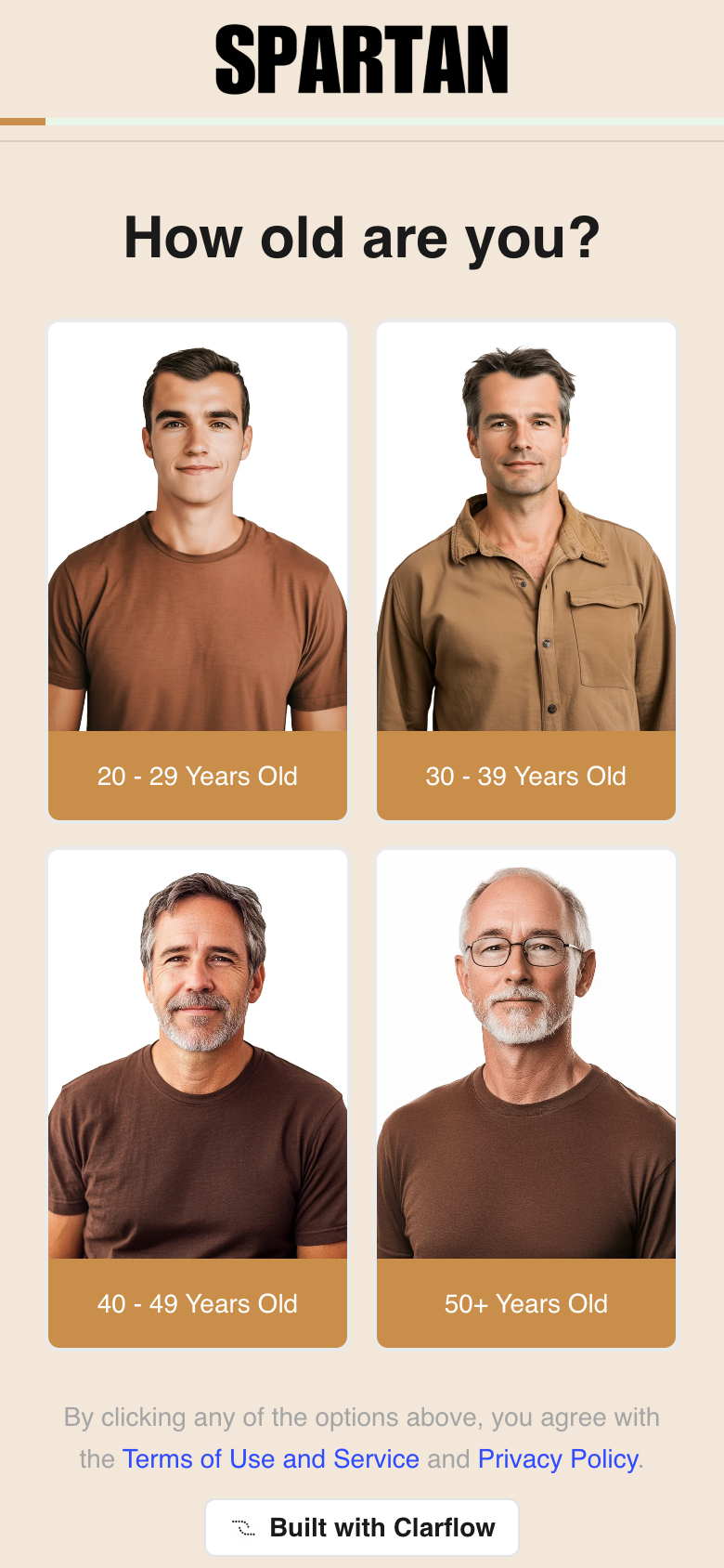
The Flow: Performance-focused ad → Photo-tile age gate (with a "Skip This Quiz" link) → Hair loss specifics → 1.4M social proof break → Lifestyle questions → Hair Profile diagnosis → 66% off bundle
See the full Spartan teardown →
The genius is in the first question. "How old are you?" with four photos of men at different ages — all wearing the same brown shirt, all looking directly at camera. You don't pick a number; you pick the guy who looks like you. That's identity-level segmentation in a single click.
But here's the move most builders miss: directly under the photo tiles is a prominent "SKIP THIS QUIZ" link. Counterintuitively, showing an exit increases completion rates. It's the door-in-the-face technique adapted for digital — by making the quiz feel optional, the people who choose to stay experience self-selected commitment. They're continuing because they chose to, not because they were forced into a flow.
Then Spartan does something almost no funnel does: it explains itself. Two of the most sensitive questions — "Does hair loss run in your family?" and "How often do you tend to experience stress?" — include a "Why we ask" expandable section. The stress one even mentions telogen effluvium by name. Most quizzes ask intrusive questions and hope users keep going. Spartan turns those questions into educational moments. Now when users see "Trigger: DHT Sensitivity" on their Hair Profile, they already know what DHT is — because the quiz taught them.
The hair loss severity question is the cherry on top: instead of a clinical scale, the options are framed by who else can see it. "A lot — It's obvious to everyone" / "Some — Those close to me notice" / "A little — Only I notice." Social visibility is the most emotionally charged way to measure hair loss. Even the mildest option implies I'm watching it happen.
What to steal: Use age-matched photo tiles in your first question — they create instant self-identification and drop bounce rate. Then add a "Why we ask" explainer to your most invasive questions. Transparency about why you're asking transforms the question from intrusive to consultative. And reframe severity scales around who notices.
4. Forge Men: The Lifestyle Profiling Engine (1M+ Visits/Month)
Forge Men sells a tallow balm for men's anti-aging skincare. The challenge? Most men don't think they need skincare. They wash their face with whatever bar of soap is in the shower and call it a day.
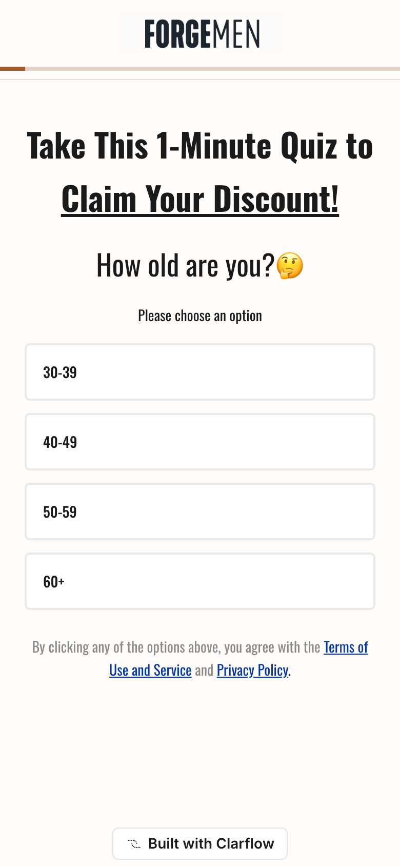
The Flow: Discount-led ad → "1-Minute Quiz" landing → Visual mirror check → 9 lifestyle questions → Skin Profile dashboard → Bio-identical oil education → Confidence pop-up → 50% off ForgeSkin Tallow Balm
See the full Forge Men teardown →
The quiz opens with "Take This 1-Minute Quiz To Claim Your Discount!" — leading with the incentive, not the product. But the real conversion happens in the middle, where Forge does something almost no skincare quiz does: it asks about your daily habits.
Coffee intake. Shower temperature. Shaving frequency. Smoking. Alcohol. Sun exposure. Stress. Sleep. By the time you've answered 9 lifestyle questions, you've handed Forge a goldmine of zero-party data — and you've sat through a free education on what's destroying your skin. "My shower temperature preference is steaming hot" feels harmless until the quiz subtly teaches you that hot water strips natural oils from your face.
Then the payoff: a Skin Profile Summary with an aging-level gauge marked HIGH in red, plus four clinical metrics — Aging Type (Extrinsic), Trigger (Stress), Room For Improvement (High), Impact on Appearance (Noticeable). The volume of inputs makes the output feel medically credible. Users believe the assessment is genuinely personalized because they answered so many granular questions. The specificity of the inputs makes the output feel like a diagnosis.
The closer is the "Did You Know?" interstitial: "Researchers discovered men can look 10 years younger within 6 months, if they apply 'bio-identical oil' on their face for just 30 seconds per day." It plants the mechanism story (bio-identical oil) and crushes the effort objection (30 seconds) — before the product even appears. By the time you see the offer, you're already convinced the mechanism works. The product just delivers it.
What to steal: Don't be afraid to ask 9+ lifestyle questions if your product can be tied back to them. The volume of questions creates perceived diagnostic rigor — users trust detailed assessments more. And every answer becomes a hyper-targeted email segment later ("As someone who gets less than 6 hours of sleep..."). Then plant your product mechanism as a research discovery, not a sales pitch — that bypasses ad resistance entirely.
5. ColonBroom: The Medical-Grade Symptom Mapper (600K+ Visits/Month)
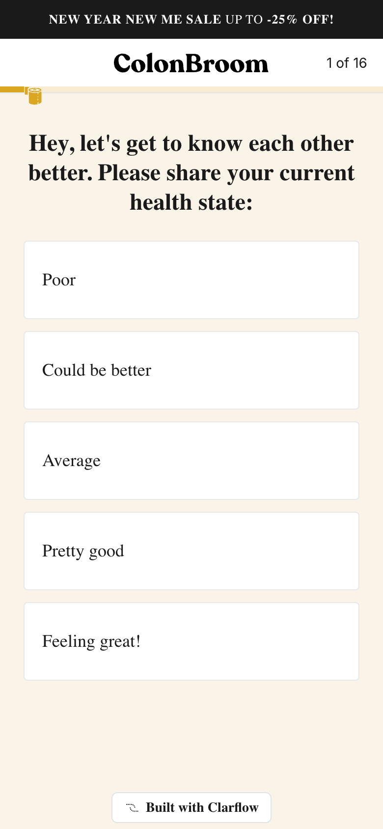
ColonBroom sells a fiber supplement for digestive health. Gut health is inherently embarrassing — bowel movements, bloating, rectal itching. Most brands flinch from the topic. ColonBroom leans into it, and their 18-step quiz reads more like a clinical intake form than a product quiz.
The Flow: Transformation ad → Female/Male landing with press logos → 13 medical-grade symptom questions → Body measurements → Email gate → "Creating your agenda..." loading screen → Personalized weight projection → 65% off subscription
See the full ColonBroom teardown →
The funnel is built around two unfair advantages.
The first is medical-grade trust architecture. Eight of ColonBroom's 13 questions are health screens: gut symptoms, stool frequency, secondary symptoms (skin issues, bad breath, heartburn), associated conditions (fungal infections, mood disorders), allergies, medical conditions (diabetes, thyroid), digestive diseases (IBS, GERD, colitis), and pregnancy/breastfeeding checks. This volume of health screening transforms a supplement quiz into something that feels like a clinical intake form. Users subconsciously elevate the brand from "fiber supplement company" to "health authority" — because no ordinary product quiz would ask about diverticulitis or oral thrush.
The second is humor. ColonBroom's copy is deliberately warm and conversational: "Many factors can impact your well-being, but feeling full of crap is at the top of the list," and "Exercise is not the only way to stay active. Multiple trips to the bathroom count, too!" By treating gut talk as normal rather than clinical, the quiz lowers the emotional barrier on questions users would otherwise lie about — and that means cleaner data and higher completion rates.
The closing move is the personalized weight projection. After capturing email and showing a "Creating your agenda..." loading screen with a branded toilet-paper mascot, the results page displays a custom weight-loss chart using the user's actual current weight and goal weight — "170 lb in April → 150 lb by May" — with specific weekly loss numbers (-7.7 lb, -2.3 lb). Generic promises are forgettable. Specific numbers tied to your own measurements feel like a prescription.
The loading screen does double duty. It makes the result feel personalized (a computer is "calculating" your plan), and it creates anticipation. By the time the results load, the user is leaning forward.
What to steal: Add a loading/calculating screen between quiz completion and results. It's a micro-commitment that increases perceived value. A result that takes 3 seconds to "generate" feels more personalized than one that appears instantly. And don't be afraid of a long medical-style screening section if your product is health-adjacent — disclosure momentum makes everything that comes after (email capture, body measurements, payment) feel trivial.
The Pattern Across All 5
Every single one of these funnels follows the same core principle: the quiz IS the conversion mechanism. The product is just what comes after.
| Brand | Niche | Quiz Length | Monthly Visits | Key Psychological Play |
|---|---|---|---|---|
| Liven | Mental Wellness | 42 steps / 26 Q | 4M+ | 5-stage psych arc + scratch-to-reveal |
| Hike Footwear | Health Footwear | 12 steps / 7 Q | 4M+ | Confession-then-reframe |
| Spartan | Hair Loss | 18 steps / 13 Q | 1M+ | Photo-tile identity + "Why we ask" |
| Forge Men | Men's Skincare | 18 steps / 13 Q | 1M+ | Lifestyle profiling + computational theater |
| ColonBroom | Gut Health | 18 steps / 13 Q | 600K+ | Medical intake + personalized projection |
None of them sell directly. They all make the reader co-create the conclusion that the product is the only logical answer.
The takeaway: more aware audiences need shorter quizzes (Hike's 7 questions). Less aware audiences need longer quizzes (Liven's 26). But every quiz needs to shift a belief before it pitches a product.
Build Your Own High-Converting Quiz Funnel
Every brand on this list is dissected step-by-step in our Funnel Teardowns library — see exactly which screen does what, and steal the patterns that fit your product.
If you want to build a funnel like Liven or Hike Footwear, you need a quiz builder that handles interstitial screens, dynamic logic, branching paths, scratch-to-reveal mechanics, and personalized results pages — without needing a developer. That's exactly what Clarflow was built for.