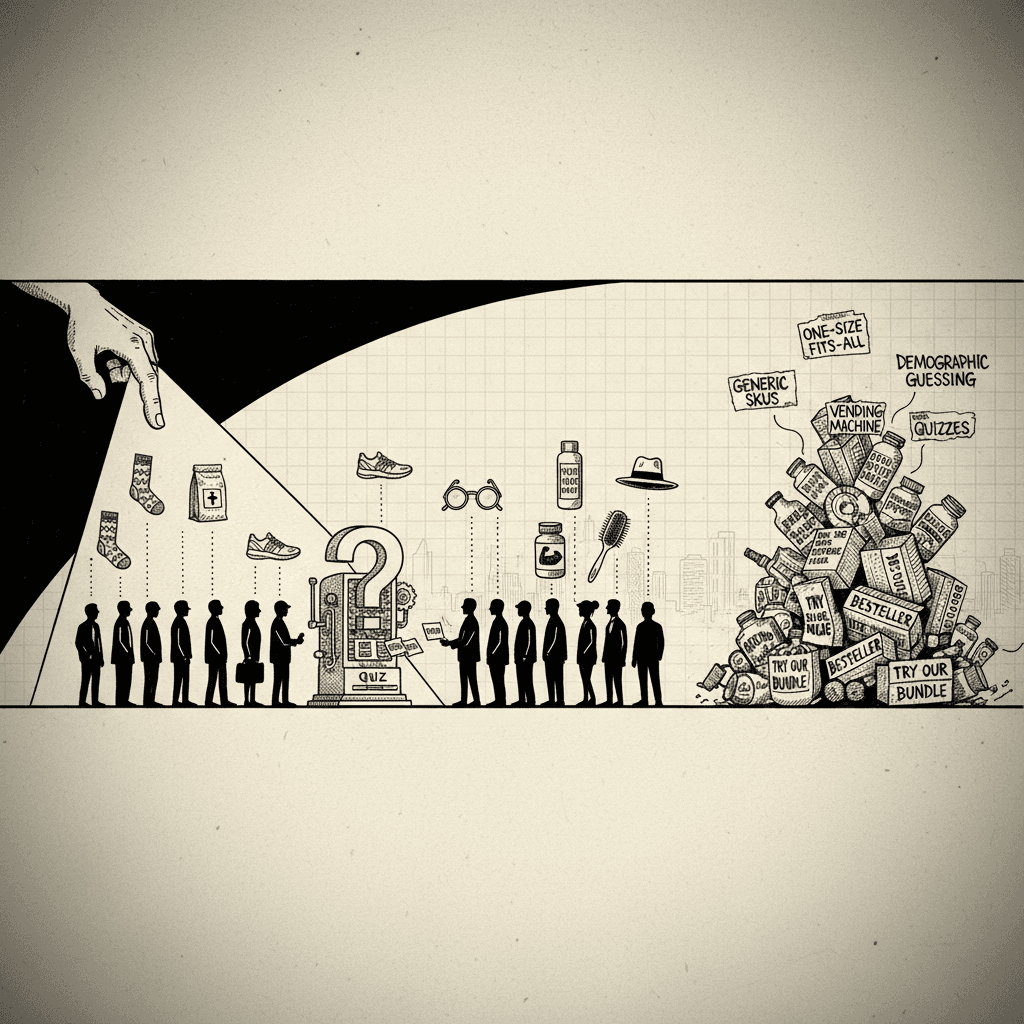
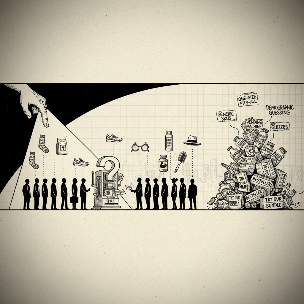
Most "product recommendation quizzes" are just glorified survey forms. Checkbox UX. A database lookup wearing a friendly hat. Five questions about your hair type, a spinner, and a SKU pops out at the end like a vending machine.
That's not a product recommendation quiz. That's a sorting algorithm.
The brands actually printing money with quizzes figured out something most builders still haven't: the quiz isn't the thing that finds the product. The quiz is the thing that sells it. It's the mechanism. Every question is a micro-commitment. Every screen is a belief shift. By the time the "recommendation" lands, the customer has already convinced themselves it's the only logical answer.
Below are 10 ecommerce quiz examples worth studying. Eight are forensic teardowns from funnels we've personally ripped apart. Two are industry legends. Every one of them has a specific tactic you can lift and paste into whatever you're building.
Let's get into it.
1. Hike Footwear: THE CONFESSION-THEN-REFRAME
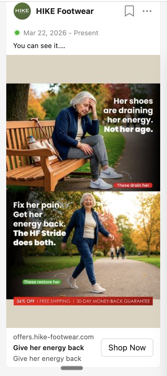
The flow: Cold Facebook ad → "No email, no obligations" landing → 7 emotional questions → Mid-quiz belief shift → Peer-matched results → 50% off offer
Hike sells barefoot shoes to adults 40+ with foot, knee, and back pain. Not fitness bros. Grandmas who stopped going on walks. And their 7-question quiz is a confession booth disguised as a foot health assessment.
The first question is the tell: "What's holding you back from enjoying life to the fullest?" Options include "limiting my independence" and "affecting my relationships." This is not a sorting question. You don't ask a grandma what her arch type is. You ask her what her feet are stealing from her.
They're not selling shoes. They're selling freedom from foot pain. By question 4, the reader has named their conditions. By question 5, they've admitted every "comfortable" shoe they've tried has failed them. The quiz is building the case against every alternative — without the brand saying a word.
Then the highest-leverage screen in the entire funnel drops:
"Most 'Comfortable' Shoes Are Weakening Your Feet."
Before this screen: "I have bad feet." After this screen: "I have weakened feet because of bad shoes." That single mechanism reframe flips the entire purchase from "maybe I'll try another shoe" to "I need to undo the damage the last 20 years of shoes did to me."
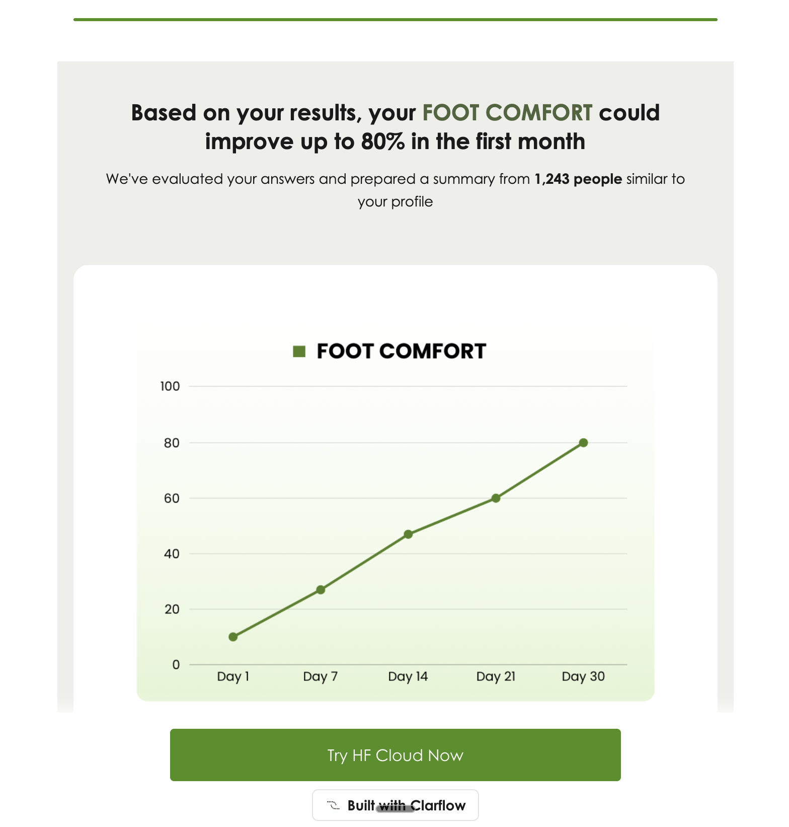
Then the results page claims "1,243 people similar to your profile" experienced 89% comfort improvement — peer-matched social proof, not celebrity endorsement.
What to steal: The confession-then-reframe sequence. Ask what they've tried, let them admit failure, then hit them with the mechanism reframe. It's competitive destruction without naming a single competitor.
2. Happy Mammoth: THE DOCTOR'S DIAGNOSIS
The flow: "Take the Quiz" FB ad → On-brand landing → 10+ symptom questions → Hidden-pain reveals → Email gate → Personalized plan → Offer
Happy Mammoth runs a gut and hormone quiz for women 35+. The tactic here is what Happy Mammoth has weaponized better than almost anyone in DTC: the doctor question.
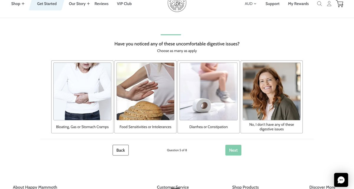
Think about what it feels like to sit in a doctor's office. The doctor doesn't walk in and prescribe something. He asks you a bunch of questions. Most feel irrelevant. Some feel invasive. But as you answer each one, you sit there thinking "shit, this might be worse than I thought. I hope he knows what's wrong with me."
When the prescription comes, you don't question it — because you trust he asked the right questions.
That's exactly the psychology Happy Mammoth is running. Early questions ask about obvious symptoms (bloating, fatigue, mood swings). Then the quiz pivots to weird, hyper-specific ones — "Do you experience afternoon crashes between 2–4pm?" The reader reads that and thinks "wait, how did they know?" That's the doctor question doing its job. It's pattern recognition dressed up as personalization.
By question 8, the quiz has surfaced problems the reader didn't even know were problems — poor sleep, afternoon crashes, cravings — and labeled them as symptoms of a bigger thing. That's self-diagnosis, and it's the most powerful lever in any product recommendation quiz. You don't have to convince them they have a problem. They told you.
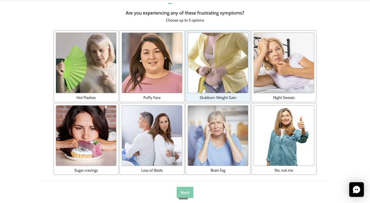
The results page then frames the recommendation as a personalized plan tied to their specific symptom cluster. Generic supplement, framed as prescribed.
What to steal: Include 1–2 "doctor questions" — weird, specific, hyper-relevant to your avatar's daily experience. Questions so specific they make the reader think "finally, someone gets me." Trust compounds from there.
3. Javvy Coffee: THE SHAME-BASED FORCING FUNCTION
The flow: IG ad → "1-Minute Protein Coffee Quiz" landing → 5 low-threat questions → Agitation interstitial → 3 forced-yes questions → 58% off bundle
Javvy sells a protein coffee concentrate. Solution-aware audience. Fitness-adjacent. They're not here to validate a pain point — they're here to convert people who already use protein and coffee into people who use Javvy's specific version.
So the quiz is short (9 steps) and the mechanism is built around micro-commitments.
Steps 1-5 are foreplay. "What protein do you currently use?" "How many coffees a day?" Low cognitive load. Every click is a tiny yes. Q4 and Q5 are sneakier than they look — they're AOV anchors disguised as personalization. You just told Javvy you drink 3 coffees a day and use 2 scoops of protein. Now the bundle pricing on the results page isn't a pitch — it's a confirmation of what you already told them you need.
Then comes Step 6 — pure agitation. "What's REALLY in your coffee and protein shakes?" Sugar. Fake flavors. Cheap incomplete proteins. Five clicks deep, and now they tell you your current routine is broken. It hits harder than a sales page because you just described that broken routine in detail yourself.
Then Steps 7, 8, and 9 — three rapid-fire yes/no questions. But the "no" options are deliberately humiliating.
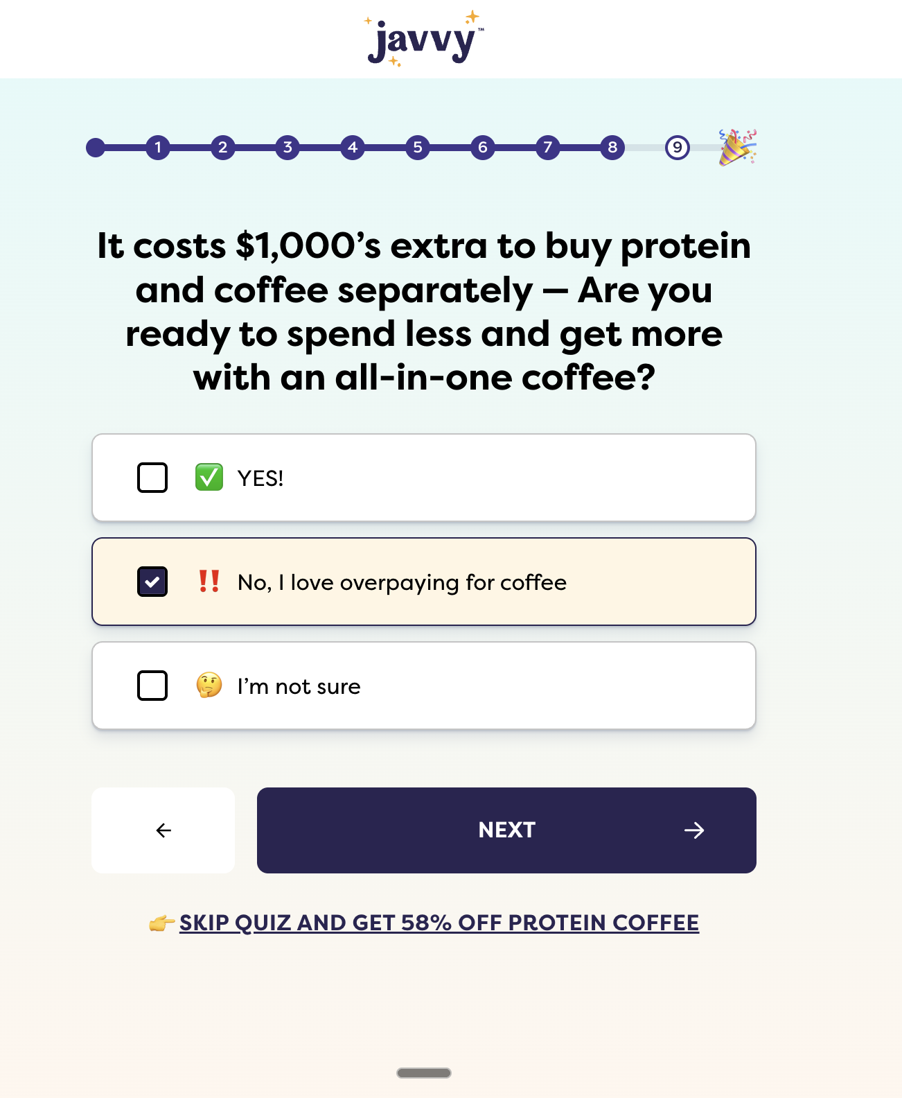
"No, I love my unhealthy habits." "No, I love overpaying for coffee." "No, I love wasting time in lines."
Nobody clicks those. They're not real options. They're a forcing function — a self-label trap. You click YES because the alternative makes you look like an idiot to yourself. Three yeses in a row. Taste objection handled. Price objection handled. Convenience objection handled. All before the offer even shows up.
They're not selling coffee. They're selling an upgrade to your identity as someone who doesn't accept garbage.
What to steal: THE SHAMEFUL NO. Frame your "no" options as identities nobody wants to claim. Fence-sitters convert because inaction feels worse than action. Every objection gets killed by a forced yes.
4. Mars Men: THE THREE-CARD SYSTEM
The flow: Facebook ad → 2-Minute Assessment landing → 15 symptom/lifestyle questions → Analyzing loader → Profile card → Future-pace card → Offer card
Mars Men sell men's health products — weight loss, TRT adjacents, hair, energy. 1.5M+ monthly visits, most of which funnel into a quiz that's doing nine figures a year. Their closing mechanism is the most transferable one on this list: THE THREE-CARD SYSTEM.
The quiz opens by framing itself as a free "assessment" — "This 2-minute assessment analyzes your symptoms, lifestyle, and risk factors to find a solution." That word matters. Customers feel they're getting something of value, not being sold to. You've given them a wine before making an ask.
Then Mars runs the doctor question play in its purest form:
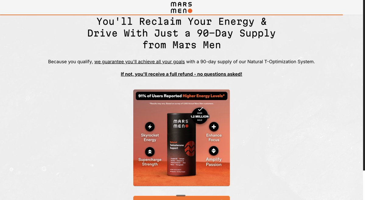
"How are your energy levels at 3pm?"
Weirdly specific. Exactly the time of day their avatar feels it. The reader sees that and thinks "finally, someone knows what I'm going through." Trust compounds immediately.
But the real art is the close. After the quiz, Mars Men runs a fake loading screen ("Analyzing your profile...") and then serves three cards in sequence:
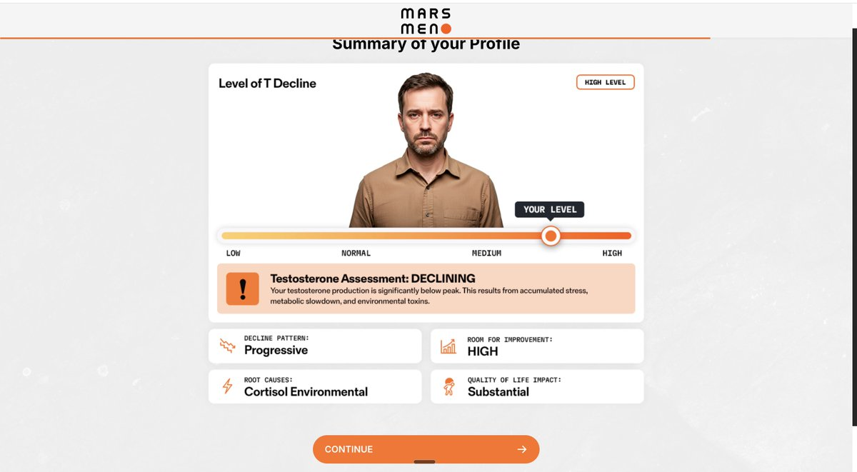
Card 1 — The Profile. Your answers, assembled into a diagnosis. Red severity gauges. Impact areas. "Here's how bad it is." Fear and urgency.
Card 2 — The Future Pace. A graph splitting two paths: where you'll be if you do nothing vs. where you can be if you act today. Time-specific ("by Feb 6"). This is the hope injection.
Card 3 — The Offer. Based on all your answers and your profile, we found the solution. Another loading screen. Prescription arrives.
The three-card system works because it mirrors a doctor's visit exactly: diagnosis → prognosis → prescription. You don't question the doctor when he writes your script. You've already co-signed the process.
They're not selling a pill. They're selling a prescription.
What to steal: THE THREE-CARD SYSTEM. Between your quiz and your offer, build three distinct cards: Profile (where you are) → Future Pace (where you could be) → Offer (the prescription). Add a fake loading screen between each. That's your entire close.
5. Mad Muscles: THE GRADUALITY PLAY
The flow: Native ad → Age/gender selector → 20+ low-friction questions → Body assessment → Personalized plan → $100M+ in subscriptions
Mad Muscles built a $100M+ quiz funnel selling tai chi workouts to people over 50. Not supplements. Not gadgets. Tai chi. For seniors. And it's one of the best product recommendation quiz examples on the planet because it nails one thing most builders still get wrong: graduality.
Most quizzes try to hit the pain point in question 1. Wrong move. The audience isn't ready. Mad Muscles opens with zero-friction demographic questions — age, gender, activity level. Build the relationship first. Earn the right to ask harder questions.
Then they rotate question types obsessively. Single select → image choice → slider → info slide → single select. Never the same format twice in a row. The reader can never zone out, can never skip into autopilot. Every screen is a new micro-interaction.
The self-diagnosis layer comes in the middle: "What pain level do you feel in a typical day?" Options are moderate or high. Either answer means they've diagnosed themselves. You didn't tell them they're in pain. They told themselves.
And the close is almost boring. Show the results. Tie it to the product. No 47-minute VSL. No scarcity countdown. The quiz already did the selling. Money's made in simplicity.
They're not selling tai chi. They're selling mobility to people who've been told they're too old to get it back.
What to steal: Graduality + question rotation. Never open with the hardest question. Never use the same question type twice in a row. Build the yes-chain before asking for anything that hurts.
6. ColonBroom (Kilo Health): THE 5-STAGE PSYCH SEQUENCE
The flow: Native FB ad → Advertorial blog → "Take Quiz" CTA → 30 questions across 5 stages → Email gate → Loading screen → Weight projection → 65% off subscription
ColonBroom is a Kilo Health property, and Kilo Health are the OGs of bringing app-onboarding psychology into physical product funnels. Their latest quiz runs a clean 5-stage psych sequence — and this is the structural gold you should be stealing from regardless of what you sell.
Stage 1 — The Self-Label Trap (Q1–Q7). Gender. Age. Zero friction. By Q7 you've already said "always" to an embarrassing behavior. You didn't answer a quiz. You told yourself you have a problem. Commitment chain started.
Stage 2 — The Agreement Barrage (Q8–Q17). 10 agree-scale statements in a row. "I feel bloated after meals." "My energy crashes in the afternoon." The only honest answer is "strongly agree." Every agreement is deeper investment.
Stage 3 — The Cost Expansion (Q18–Q19). Now the quiz asks how the problem affects your WORK, your RELATIONSHIPS, your WALLET. Pain in your head is ignorable. Pain spread across your career is not.
Stage 4 — The Hope Reframe. An interstitial drops right after the cost expansion: "87% of people with these symptoms see improvement when they switch to X." 18 questions of feeling broken, then one screen telling you your problem has a solution. Perfectly timed.
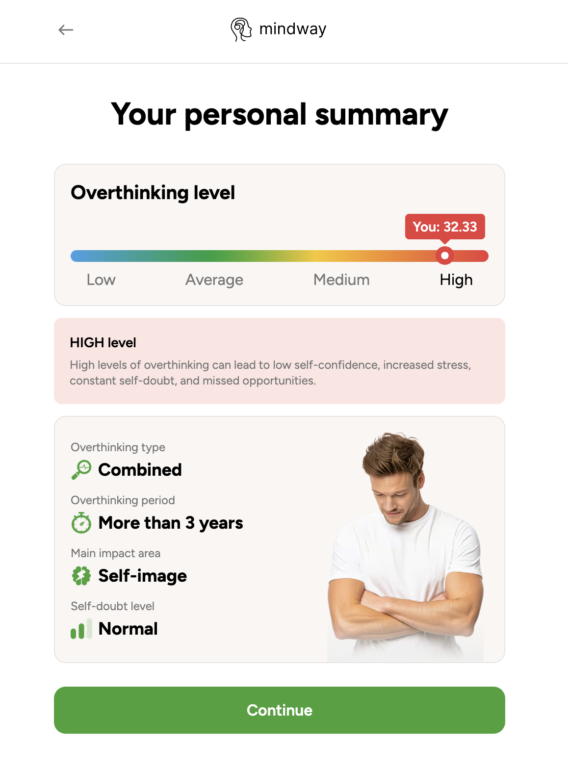
Stage 5 — The Pseudo-Diagnosis. Results look clinical. Score: 32/100, red. Severity: high. Impact areas: listed. It's not a quiz result. It's a diagnosis. The prescription is loading.
Then the kill shot: a personalized weight projection using the user's actual current and goal weight — "170 lb in April → 150 lb by May" — with weekly loss specifics. Generic promises are forgettable. Specific numbers tied to your own body feel like a prescription.
What to steal: The 5-stage sequence is copy-pasteable. Self-label → Deepen → Cost expand → Hope inject → Diagnose. Use it for any health-adjacent product and you'll outperform any direct landing page you've ever built.
7. Liven (Kilo Health): THE STATEMENT BARRAGE
The flow: Native ad → Gender landing → 26 agree-scale statements → Authority stack → Pseudo-diagnosis → Scratch-to-reveal → Subscription pricing
Liven is Kilo Health's mental wellness flagship. 4M+ visits/month. 42 steps. 26 questions. The longest quiz we've ever broken down — and the most psychologically surgical. What makes Liven a standout product recommendation quiz example isn't its length. It's how it weaponizes one specific format: statements, not questions.
Most quizzes ask: "Do you sometimes feel anxious?" That's a question. You can say no.
Liven serves: "I often feel overwhelmed by the amount of tasks I have to do." That's a statement. You can only agree or disagree. Ten of these in a row, and the only honest answer to every single one is "Strongly Agree."
Each strongly agree is a tiny yes. Each yes is an admission. Each admission is self-diagnosis without the cost of being told. By the 15th statement, the reader has built a complete internal case that they have a real mental wellness issue — and they built it themselves.
That's the entire mechanism. Claims are cheap. Self-made convictions are free and priceless.
Then Liven runs a triple authority stack — Harvard/Oxford logos, a licensed counselor, a "2.5M+ users" world map — right when the reader is most emotionally vulnerable. Then a clinical results page ("HIGH negative effect" gauge, four metrics) that looks like a diagnosis screen from a medical portal. Then a scratch-to-reveal 50% off.
They're not selling a journaling app. They're selling a sense that someone finally sees you.
What to steal: THE STATEMENT BARRAGE. Replace half your quiz questions with agree-scale statements. Statements force self-diagnosis in a way multiple-choice questions never can. Every "Strongly Agree" is a micro-commitment you didn't have to earn.
8. Care/of: THE INGREDIENT-MATCHED RESULTS
The flow: Instagram ad → Friendly welcome → 20+ lifestyle and goal questions → "Matching your ingredients..." loader → Personalized daily vitamin pack → Subscription
Care/of is the widely cited poster child for product recommendation quizzes in the vitamin space — and with good reason. They took a category that had been run the same way for 50 years (walk into CVS, squint at a shelf, guess) and rebuilt the buying experience around personalization the customer could feel.
The mechanism: every ingredient recommendation on the results page is explicitly tied back to an answer the customer just gave. "You mentioned you struggle with stress → we added ashwagandha." "You mentioned poor sleep → we added magnesium glycinate." Each ingredient card shows a short bit of research, a source, and a "why this is in your pack" line. It's not a generic multivitamin. It's your pack.
The self-diagnosis layer is baked in at the goal stage — the customer picks their top 3 priorities (energy, immunity, sleep, skin, stress, etc.) and then the quiz flows them through more specific questions for each. By the time they reach the results page, they've co-created the formula. They're not buying a product. They're buying the output of their own input.
They're not selling vitamins. They're selling the illusion (and, to be fair, the reality) of clinical attention in a category where nobody else was giving any.
What to steal: INGREDIENT MATCHING. On your results page, explicitly tie each product element back to a specific answer the user gave. "Because you said X, we added Y." That one sentence does more for perceived personalization than any diagnostic gauge ever will.
9. Function of Beauty: THE CUSTOM FORMULATION
The flow: Paid social ad → Hair goal selector → 15+ quiz questions → Formula preview → Bottle customization → Checkout
Function of Beauty turned a hair care quiz into a full custom-formulation engine. The quiz asks about your hair type (straight, wavy, curly, coily), hair structure (fine/medium/thick), moisture level, scalp condition, and — the key move — your top 5 hair goals from a big menu (volumize, hydrate, anti-frizz, strengthen, deep condition, etc.).
Then the quiz generates a unique formula keyed to a specific ID. The customer can name the bottle. Pick a color. Pick a fragrance. By the time they checkout, they're not buying a shampoo — they're buying their shampoo. With their name on it. In their color.
This is personalization taken to its logical conclusion: the product itself is physically different based on the quiz answers. The mechanism isn't new ingredients. It's new ingredient ratios, generated per customer. And that alone is enough to differentiate in a category stacked with mature brands.
But notice the psychological play running underneath the customization theater: every quiz answer is a micro-commitment the customer can see in the final product. "I chose coily hair, anti-frizz, and vanilla — so of course this bottle is for me." You can't return your own custom formula and feel good about it.
They're not selling shampoo. They're selling a bottle with your name on it.
What to steal: Make at least ONE part of the final product feel physically bespoke. Even if your SKUs are fixed, you can add a name tag, a color choice, or a "formula ID" on the packaging. Co-creation beats choice every time.
10. Warby Parker: THE STYLE FINDER
The flow: Instagram ad → Face shape quiz → Style preference questions → Curated frame carousel → Home Try-On (5 frames, free) → Checkout
Warby Parker is the oldest quiz in this list and still one of the best product recommendation quiz examples in retail. The mechanism: face shape + style preference = a curated set of 5 frames shipped to your door. Free. No commitment.
What's quietly genius is how the quiz sidesteps the two biggest objections in the eyewear category at once. Objection 1: "I don't know what looks good on me." Quiz handles it — they'll tell you, based on your face shape, with visual examples of each shape so you can identify yours. Objection 2: "I can't buy glasses without trying them on." Quiz handles it — Home Try-On is free, 5 frames for 5 days, send them back if you hate them.
The quiz is the thing that qualifies them into the Home Try-On program, which is the actual conversion mechanism. Once you've gotten 5 frames in the mail and taken selfies in all of them, you're not going back to LensCrafters. Warby knows the Home Try-On box is the offer. The quiz's only job is to get you there believing the 5 frames inside will actually be your style. And because the quiz captured your face shape and style preferences explicitly, the box feels curated — not random.
They're not selling glasses. They're selling the confidence to commit to a face.
What to steal: Use the quiz as the qualifier into your strongest offer, not as the offer itself. If you have a try-before-you-buy option, a sample pack, or a consultation, let the quiz feel like the gate that unlocks it. The quiz captures the data. The try-on closes the sale.
The Common Thread
Look at all 10 of these product recommendation quiz examples side by side and the same four patterns keep showing up. Every winning quiz runs this playbook:
1. The customer self-diagnoses. None of these quizzes tell the customer they have a problem. They let the customer arrive there themselves. Hike makes them confess. Happy Mammoth runs the doctor question. Liven serves statements. ColonBroom uses agree-scale. You don't have to convince them they have a problem. They told you.
2. Micro-commitments, not multiple choice. Every question is a small yes. Every yes compounds. By question 8, buying is just momentum. The worst thing you can do is treat the quiz as a segmentation form. It's a yes-chain.
3. Reframe the problem before recommending a solution. Every single one of these funnels has at least one interstitial that shifts the belief about what the problem actually is. Hike: your comfortable shoes are the cause. Javvy: your coffee is junk. Happy Mammoth: your afternoon crash is a symptom. That reframe is the mechanism. Without it, the recommendation is just a SKU. With it, the recommendation is the only logical answer.
4. The result feels earned, not generic. Personalized gauges. Named score types. Ingredient-to-answer mapping. A three-second loading screen that "calculates" your plan. All of it works because the customer has invested 3 minutes of their time, and their brain needs to feel like that time produced something specific to them. If your results page could be emailed to any quiz taker, you've wasted the quiz.
The 5 Things Bad Product Recommendation Quizzes Get Wrong
Now the anti-patterns. Every time we see a quiz funnel that flops, it's breaking at least three of these rules.
1. Treating the quiz as a sorting tool instead of a sales mechanism. This is the foundational sin. If your quiz exists to "match customers with the right SKU," you've built a vending machine. The quiz isn't there to sort. It's there to shift belief, pre-handle objections, and build self-diagnosis before the offer shows up. Sorting is a byproduct. Selling is the point.
2. Opening with demographic questions that feel like data collection. "What's your skin type?" in question 1 is a boring opener. It signals to the customer that this is a form, not a conversation. Open with emotion, identification, or a goal ("What would you most like to fix?") — the demographics can come once you've earned the right to ask.
3. No mid-quiz reframe or belief shift. This is the biggest miss. A quiz without a reframe is just Q&A. Every good product recommendation quiz example above has at least one interstitial that changes how the customer thinks about their own problem. If yours doesn't, you're wasting 15 questions.
4. Generic results page that could apply to anyone. "Based on your answers, here's our recommendation: [top SKU]." If your results page doesn't visibly reference what the user just told you — their goals, their symptoms, their lifestyle — the personalization promise breaks. And once it breaks, the whole quiz feels like a bait-and-switch.
5. No retargeting after quiz completion. The quiz captured zero-party data on every person who took it — including the 60% who didn't buy. Most brands do nothing with that data. Run email flows segmented by answer. "You said your main issue was [X] — here's why our [product] is built for exactly that." Someone who told you their life problem and didn't buy is the warmest lead you'll ever have.
The Play
The brands winning with product recommendation quizzes aren't winning because they have fancier logic or cleaner UX. They're winning because they understood one thing: the quiz itself is the mechanism. It's how belief gets built in real time, one micro-commitment at a time.
Every brand on this list is running the same underlying play: make the customer self-diagnose, reframe the problem, serve a result that feels earned, and only then present the offer. Do those four things and the conversion rate math changes. Fail to do any of them and you've built a survey form.
Being the only brand in your category that actually talks to the customer before asking for money? That's your arbitrage.
Build a Quiz Funnel That Actually Sells
Most quiz builders on the market were designed for logic — branching, routing, SKU matching. They treat the quiz like a spreadsheet.
Clarflow was built around the psychology instead. Interstitial reframes. Statement barrages. Fake loading screens. Three-card closing sequences. Scratch-to-reveal. Peer-matched social proof. Every pattern in this article is a native block — no dev required.
If you want to build a product recommendation quiz that works like the 10 above, start building for free →
Or if you want to see each of these broken down step-by-step, our Funnel Teardowns library has the question-by-question analysis for every funnel on this list.